Web Design
The Website Centerpiece: What the First Screen Can and Can’t Do
The first thing a visitor sees can make a site feel distinctive. It can also get in the way. The research on first impressions, attention, credibility, and performance makes a useful case for knowing the difference.
Web designers can spend an extraordinary amount of time on the first screen of a site. We debate the photograph, the scale of the headline, whether the product should move, whether the logo should animate, and how much of the page a visitor ought to see before scrolling. That central visual or interactive idea is the website’s centerpiece. Sometimes it is an image. Sometimes it is a demonstration, a piece of typography, or a whole small world built in the browser.
The attention makes sense. That first screen carries a difficult assignment: introduce an unfamiliar business and give someone a reason to keep going. But the design industry has a habit of treating “memorable” as if it were a measurable outcome on its own. A dramatic centerpiece may be remembered for the wrong reason, or remembered without the business attached to it.
So the more useful question is whether a centerpiece helps visitors understand the site and act on it. Research offers clues, though it does not produce a universal recipe for a high-converting hero section.
The judgment arrives before the reading
In a 2006 study of homepage screenshots, Gitte Lindgaard and colleagues asked people to rate visual appeal after very brief exposures. Ratings made after 50 milliseconds were strongly consistent with ratings made after longer exposures. People could form an aesthetic judgment remarkably fast, before they had time to read much of the page.
That finding is often recast as “you have 50 milliseconds before visitors leave.” The paper does not say that. Its participants rated screenshots in a controlled experiment. They were not deciding whether to hire a business, reading its services, or navigating a live website. The result concerns visual appeal judgments, not departure rates or conversion.
Still, it gives the first screen real weight. Color, composition, density, and overall coherence register before the visitor has carefully evaluated the offer. The centerpiece contributes to that first impression, but so does everything around it. A striking image next to cramped text and uncertain navigation sends a mixed signal.
There is another limit worth keeping in mind: a quick aesthetic opinion is only the beginning of a visit. Once people try to find a service, compare options, or make contact, the website has to earn the favorable impression it may have created.
Simple doesn’t have to mean forgettable
An unusual centerpiece seems like an obvious route to differentiation. Yet originality has a cost when it makes a page difficult to parse.
Research by Alexandre Tuch and colleagues examined aesthetic ratings of real website screenshots. In one experiment, the researchers used 119 screenshots and varied how long participants saw them. A second experiment tested exposures as short as 17 milliseconds. Lower visual complexity and a more recognizable category pattern tended to receive higher appeal ratings. The effect of complexity appeared even at the shortest exposure, while the effect of familiarity became clearer with more viewing time.
These are judgments about screenshots, not proof that a conventional layout sells more or that every elaborate visual is a mistake. The useful design tension is subtler. A website can be distinctive at its center while remaining legible at its edges. Let the product visualization be unusual; keep the service name, navigation, and next step easy to find. Let the typography have character; make sure it still says what the business does.
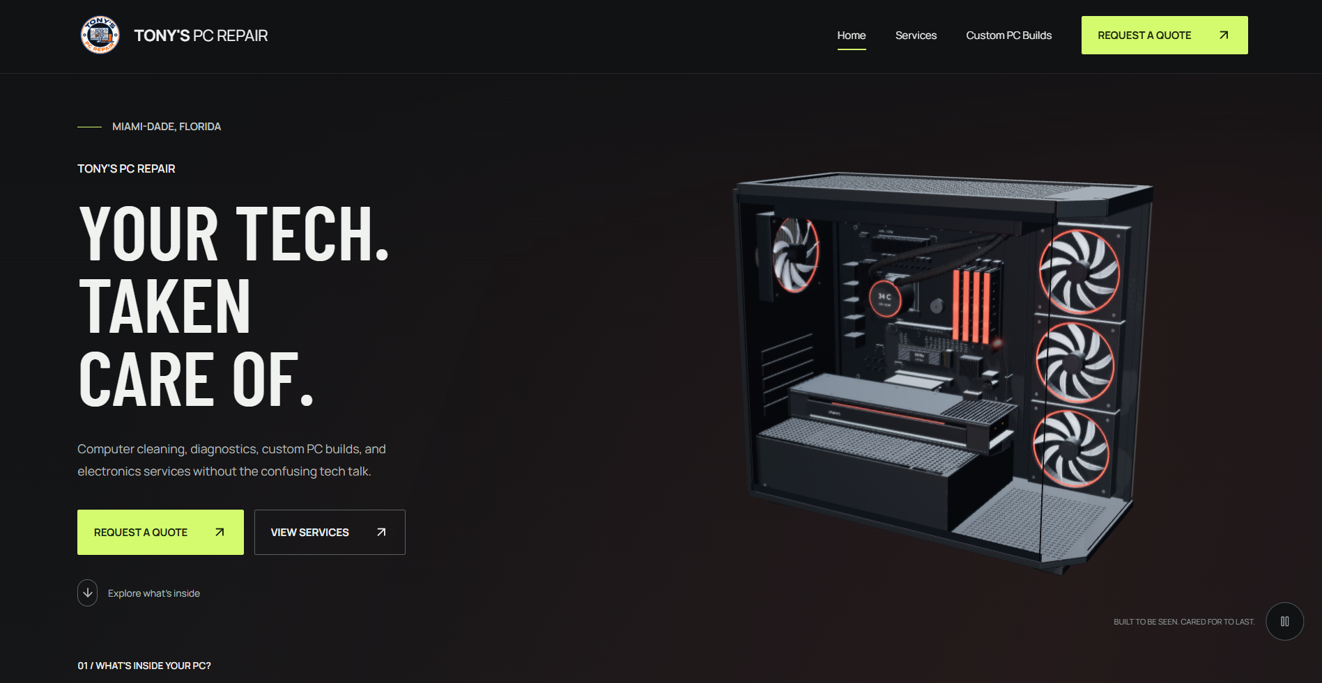
For many businesses, this is where the centerpiece earns its place. It makes the site recognizably theirs without asking a new visitor to learn a new interface language first. A homepage for a computer repair company can show the hardware and the character of the brand, while still plainly offering services and a quote path. A law firm, restaurant, or moving company would need a different central idea. The design should come from the business, not from a trend library.
Where attention actually goes
An eye-tracking study offers a different view of the first screen. Hong Sheng, Nick Lockwood, and Sirjana Dahal reported that participants took about 2.66 seconds to scan a website before fixating on a particular element. The researchers also examined attention to areas including logos, navigation, images, and text.
The context matters. The underlying Missouri S&T thesis describes 20 students looking at static screenshots of 25 university homepages. That cannot tell us where every customer will look on a moving site, a phone, or a Miami service-business homepage. Nor does a gaze at an image mean the image persuaded someone to inquire.
It does complicate the idea that only the centerpiece matters. People scan a composition. A logo can help establish whose site this is; navigation can signal what is available; a main image can offer context. The first screen works as a system of cues. If the visual absorbs all the attention but the service and action remain obscure, the hierarchy has failed even if the image is beautiful.
Consider the homepage we built for Tony’s PC Repair. Its computer visualization is the obvious centerpiece, but the screen also names the business, states its Miami-Dade context, describes the work in plain language, and presents “Request a Quote” and “View Services.” The image carries the subject; the copy and controls explain what to do with that subject. That is a design rationale, not a claim that the visual produced a measured increase in inquiries.
Design can suggest credibility. It cannot supply it.
A Stanford Web Credibility Project report makes the stakes clearer. In the 2002 study, people compared live sites and explained their credibility judgments in written comments. The researchers coded 2,440 comments. “Design look” appeared in 46.1% of them, more often than any other coded category. The category included layout, typography, white space, images, and color, and it could be mentioned favorably or unfavorably.
The figure is not a conversion rate. It also does not mean 46.1% of people trust a website because it looks good. It tells us that visual presentation frequently entered the explanations participants gave for perceived credibility in that study. The report is now more than two decades old, and its broad “design look” category does not isolate the effect of a single hero image.
That distinction between perceived and earned credibility matters for a small business. A careful first screen can suggest attention to detail. But actual credibility has to survive contact with accurate service information, working forms, clear policies, real project evidence, and the quality of the work itself. A centerpiece can open the door. It cannot verify the claims behind it.
FUENTES INSIGHTS
Grow Your Business Online.
Get practical insights on websites, Google visibility, branding, SEO, and digital marketing—written for small-business owners.
Beautiful can feel easier. Then people try to use it.
The design literature has long examined the relationship between appearance and usability. In What is beautiful is usable, Noam Tractinsky, Adi S. Katz, and Dror Ikar found that aesthetics influenced how participants perceived the usability of an ATM-like interface. That is an intriguing effect, but perceived usability is not the same as completing a task successfully.
Later work made the relationship less tidy. In an experiment with 80 participants and four versions of an online shop, Tuch and colleagues varied appearance and usability separately. In that setting, visual beauty did not change participants’ usability ratings. Poor usability did, however, lower how beautiful they found the shop after using it.
There is a practical lesson in that disagreement. A compelling first screen might give a visitor an optimistic start, but the rest of the journey can revise that impression. The quote button must lead somewhere useful. The menu must behave as expected. On a phone, the artwork cannot make the service description tiny or push the next step out of reach. If a visitor has to work around the centerpiece, the site is asking design to excuse a design problem.
This is why the most revealing review of a homepage is rarely a screenshot critique alone. Ask someone unfamiliar with the business to tell you what it offers, where it operates, and what they would do next. Then watch them try. Their answer says more than a debate about whether the animation feels premium.
The first thing people see may also be what they wait for
Large visual ideas have a technical cost. The hero image, video poster, or oversized headline often becomes the page’s Largest Contentful Paint element: the largest qualifying image or text block rendered in the initial viewport. Google’s web.dev guidance classifies LCP of 2.5 seconds or less as “good” when measured at the 75th percentile of page visits, separately for mobile and desktop.
An image is not automatically the LCP element, and LCP is not a direct measure of whether people liked the page. But the overlap between dominant imagery and loading experience is substantial. The 2025 Web Almanac’s HTTP Archive analysis found that an image was the LCP element on 76% of sampled mobile pages. That is a page-sample statistic, not a claim about all visits or a verdict on any particular homepage.
Here is the paradox: the image intended to make the first impression can postpone the moment the page feels complete. A heavyweight video, an image discovered late by the browser, or a visual assembled only after a large script runs can leave a visitor staring at empty or half-finished space. The fix is not to remove every rich visual. It is to treat delivery as part of the design: choose the appropriate format and size, make the important asset available early, and check the actual mobile experience. Web.dev’s LCP optimization guidance is especially relevant when the hero image is the largest element.
Sometimes strong typography is a better centerpiece than a large asset. Sometimes a static image communicates the idea faster than a video. A business should not pay a loading penalty for motion that adds no information.
Motion can guide attention, or spend it
Animation can reveal a product, show a transformation, or give a brand a particular rhythm. It can also keep drawing the eye back to an area after the visitor has decided to read. On a small screen, where the headline, visual, and action may stack, motion has even less room to stay politely in the background.
Accessibility guidance gives this a concrete boundary. WCAG 2.2’s Pause, Stop, Hide criterion applies to certain automatically moving, blinking, or scrolling content that lasts more than five seconds, appears alongside other content, and is not essential: people need a way to pause, stop, or hide it. Auto-updating content has a related but distinct requirement. This does not mean that all animation is prohibited. It means designers have to consider when movement competes with use of the page. The browser’s reduced-motion preference provides another way to respect visitors who request less nonessential motion.
There is also a less obvious risk: attention-grabbing design can be ignored. In Jan Panero Benway’s 1998 banner-blindness experiments, people trying to find information sometimes missed conspicuous banner-like links. The study concerns task-oriented users and banner designs of its era; it does not prove that bright modern hero sections are invisible. It does warn against a simple assumption that size, color, or movement guarantees useful attention. When a centerpiece looks like an unrelated promotion, visitors may look past it to complete the task they came for.
The question for animation is therefore specific: what does the movement explain? If stopping it makes the central message disappear, the site may be relying on motion too heavily. If it simply repeats without adding meaning, it may be consuming attention and device resources for no clear return.
What a centerpiece is actually for
The studies above investigate different things: aesthetic ratings, eye movements, credibility comments, perceived usability, task behavior, and loading. None establishes a universal conversion lift from adding a larger image or a more elaborate animation. Taken together, they suggest a better standard for judging the first screen.
An effective centerpiece should make the business easier to recognize and the offer easier to grasp. Its visual form should belong to the subject: the work, product, people, or point of view that makes the business distinct. It should sit within a familiar enough structure that visitors can orient themselves quickly. The message and next step should remain clear without waiting for an animation to finish or hunting around an illustration.
That standard changes the design conversation. Instead of asking, “How impressive can we make the hero?” ask what a first-time visitor could correctly say after seeing it. Would they know whose site this is? What is offered? Why this business might be relevant to them? What happens when they press the main button? Those are questions a small business can test with real people, including on a phone, before it argues over one more visual effect.
The answer will vary. A product that is difficult to explain in words may benefit from a short visual demonstration. A service business with strong real photography may need very little motion. A studio can use expressive typography or an interactive piece to communicate its design sensibility, provided the work does not bury the service and contact path. The quietest solution may be the most distinctive one in a crowded category.
At Fuentes Marketing & Design, we care about the first impression because it is part of a longer experience, not the whole experience. A website has to be understandable, load promptly, work across devices and accessibility preferences, and be honest about the business behind it. If you suspect your first screen is doing too much or too little, our free website audit is a place to start that conversation.
Research & Sources
- Lindgaard, Fernandes, Dudek, and Brown, “Attention web designers: You have 50 milliseconds to make a good first impression!”, Behaviour & Information Technology (2006).
- Tuch, Presslaber, Stoecklin, Opwis, and Bargas-Avila, “The role of visual complexity and prototypicality regarding first impression of websites”, International Journal of Human-Computer Studies (2012).
- Sheng, Lockwood, and Dahal, “Eyes Don’t Lie: Understanding Users’ First Impressions on Websites using Eye Tracking”, conference paper (2013); Dahal’s Missouri S&T thesis documenting the study design (2011).
- Fogg and colleagues, “How Do People Evaluate a Web Site’s Credibility?”, Stanford Persuasive Technology Lab / Consumer WebWatch (2002).
- Tractinsky, Katz, and Ikar, “What is beautiful is usable”, Interacting with Computers (2000); Tuch and colleagues’ later experiment and interpretation (2012).
- Google web.dev, “Largest Contentful Paint” and “Optimize Largest Contentful Paint”; HTTP Archive, 2025 Web Almanac: Performance.
- W3C, WCAG 2.2 Understanding 2.2.2 “Pause, Stop, Hide”; MDN,
prefers-reduced-motion. - Benway, “Banner Blindness: The Irony of Attention Grabbing on the World Wide Web”, Proceedings of the Human Factors and Ergonomics Society Annual Meeting (1998).